Emilia Kina & Filip Rybkowski: „Miraż Travel”Emilia Kina & Filip Rybkowski: „Mirage Travel”
Emilia Kina & Filip Rybkowski: „Miraż Travel”
10.05–15.06.2019 [wystawa skrócona o 1 dzień!]
otwarcie wystawy: 10.05 (piątek), godz. 18.00 / wstęp wolny
Galeria Sztuki Wozownia w Toruniu, ul. Ducha św. 6
kuratorka: Natalia Cieślak
Wiadomo, że im lżejszy plecak, tym łatwiej się podróżuje. Jednak bagaż kulturowych kontekstów, mniej lub bardziej ugruntowanych stereotypów czy skojarzeń, wiążących się z określonymi słowami, obrazami czy przedmiotami, jakie napotykamy na swojej drodze, jest ogromny i niepomiernie wpływa na przypisywane im znaczenia.
Wspólna wystawa Emilii Kiny i Filipa Rybkowskiego pt. „Miraż Travel” to projekt o poszukiwaniu sensów, a pretekstów do namysłu nad tym problemem dostarcza wędrówka, w jaką zabierają nas artyści wraz z wyimaginowanym, tytułowym biurem podróży. Przemierzając ekspozycję, dryfujemy przez przestrzeń, w której punkty przystankowe wyznacza lokalizacja poszczególnych prac. Artyści nawiązują w swoich realizacjach do historii sztuki, ale także praktyk konsumpcyjnych czy formuł reklamowych; aluzyjnie odnoszą się też do rytuałów, jakie zwykle towarzyszą wojażom, oraz prób zatrzymania śladów tych doświadczeń już po powrocie do codzienności. W czasie tej peregrynacji napotykamy na fenomeny, które dają się w pewnej mierze odnieść do tego, z czym mieliśmy okazję się już zetknąć, ale funkcjonują one w kompletnie innym wymiarze.
Reklamowe roll upy – jeszcze/już niewypełnione krzykliwą treścią – trwają tu jako płaszczyzna gotowa, by nieść nowy przekaz. Przywożone z podróży pocztówki, reprodukujące zwykle widoki miejsc, które odwiedziliśmy, w wersji przygotowanej przez Emilię Kinę stają się bardzo luźną reminiscencją fragmentów krajobrazów, bez wyraźnie wskazanego punktu odniesienia. Podobnie rzecz ma się z ogromnym muralem, który w minimalistycznej, skrajnie uproszczonej formie generuje skojarzenia z pejzażem, gdzie dominują barwy piasku i nieba (lub tafli wody). Błękit i beż wzięto z gotowego wzornika farb przeznaczonych do malowania wnętrz. Mające pobudzać wyobraźnię nazwy, jakie nadał im producent, zostały dosłownie wmalowane w płaszczyzny pokrywającego ściany koloru. Analogicznie „wdrukowuje się” treści w stockowe zdjęcia, którymi żonglują w Internecie na prawo i lewo. W zależności od kontekstu, w jakim się je umieści, można nadać im dowolny wydźwięk i wymowę. Spiętrzenie znaczeń, jakie się w ten sposób dokonuje, sprawia, że w ostatecznym rozrachunku fotografie same w sobie znaczeń nie mają – pojawiają się one bowiem dopiero, gdy wskażemy zewnętrzny punkt odniesienia.
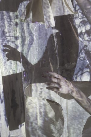
Przewijający się na wystawie motyw obrazu niewyraźnego – nieostrego, rozlewającego się, częściowo zasłoniętego, a w końcu ocierającego się o złudzenie i fatamorganę – jest figurą, dzięki której artyści zadają pytanie: czy rzeczy są takimi, jakie są, czy takimi, jakimi nam się wydają? Czy to, co widzimy i jak widzimy, warunkowane jest samo przez się, a może w większej mierze zależy od sensów, których źródła tkwią gdzieś zupełnie indziej? Grząska materia, w jaką wkraczamy, utwierdza nas tylko w przekonaniu, że znaczenie to przelotny miraż…
Emilia Kina – urodzona w 1990 r. w Krakowie. W latach 2010–2015 studiowała na Akademii Sztuk Pięknych im. Jana Matejki w Krakowie. Dyplom z malarstwa obroniła w pracowni prof. Adama Brinckena, a aneks z fotografii w pracowni draTomasa Agata Błońskiego. Zajmuje się malarstwem i fotografią. W swoich pracach łączy doświadczenia zdobyte podczas pracy w obu tych mediach, a ich wzajemne zależności są przedmiotem jej badań. Interesuje ją materialność obrazu, prosta forma wynikająca ze złożonych zagadnień. Realizacje mają swoje źródło w refleksji teoretycznej, często swoje odniesienia znajdując w malarstwie dawnym i teorii fotografii. Jej prace prezentowane były m.in. w Gdańskiej Galerii Miejskiej, Fundacji Stefana Gierowskiego w Warszawie, BWA Katowice czy Muzeum Sztuki Współczesnej MOCAK w Krakowie.
Filip Rybkowski – urodzony w 1991 r. w Szczecinie. W latach 2010–2015 studiował na Akademii Sztuk Pięknych im. Jana Matejki w Krakowie. Dyplom obronił w pracowni malarstwa prof. Andrzeja Bednarczyka, a aneks z fotografii w pracowni dra Tomasa Agata Błońskiego. Obecnie jest studentem drugiego roku Środowiskowych Studiów Doktoranckich na macierzystej uczelni. W swojej twórczości łączy różne media. Silnie odwołuje się do historii sztuki, czasowości dzieła i jego wyjątkowości, odnosząc się przy tym do zagadnienia zabytku. Kluczowe miejsce w jego refleksji teoretycznej zajmuje obraz i przynależny mu kontekst kulturowy. Jego prace pokazywane były m.in. w Muzeum Współczesnym Wrocław, Gdańskiej Galerii Miejskiej, Fundacji Stefana Gierowskiego w Warszawie, Krakauer Haus Nurnberg.


Emilia Kina & Filip Rybkowski: „Mirage Travel”
10.05–15.06.2019
exhibition opening: 10.05 (Friday), 6 PM / admission free
curated by: Natalia Cieślak
Emilia Kina and Filip Rybkowski’s joint exhibition entitled ‘Mirage Travel’ is a project on seeking sense and on fuzzy boundaries of meanings. The pretext for poring over these problems is a trip the artists are taking us for, along with the eponymous imaginary travel agency. Before we embark on this journey, we spend a short while in the waiting room, though. Here we encounter a shape in a chair, its form alluding to an ancient artefact of mysterious design(ation) discovered some time ago. Is this our soon-to-be companion? Unlikely, since, as the fitting title (Waiting for the meaning, 2019) shows, the sculpture is awaiting the fateful resolution of researchers’ disputes once they have studied its potential, hidden significance. Suspended in a semantic void, the figure is thus stuck, much like personages in Samuel Beckett’s play that keep looking for Godot who is in no hurry to appear whatsoever. His advent would offer a chance at salvation: at finding the meaning, and consequently at turning over a new leaf. But what you are so eagerly expecting still isn’t coming…
A semi-transparent curtain that separates the waiting room allows you to take a peek at the space you are about to start drifting through. The locations of particular works mark the stops. In their artwork, the artists allude to both art history and consumer practices or advertising formulas; likewise, they hint at rituals that frequently accompany voyages and at the attempts you make to retain traces of a travel experience once you go back to the everyday. While globetrotting, we encounter phenomena which are somewhat comparable to what we have known before. Still, they are coming from and referring to a radically different reality.
What kind of visual messages do we face most often? Adverts, which – as noted by John Berger, writer and visual culture theorist[1] – ‘are continually passing us, like express trains on their way to some distant terminus. We are static; they are dynamic …’ Emilia Kina took a subversive approach to this remark. Her roller banners (Untitled, 2017) have either not been filled with flashy marketing content yet or no longer are. The installation is here all the same, still ready to display new messages. In this manner, Kina points to the limitless potential an image holds. The visual may, like an advert, strike a chord in terms of your desires, set your imagination ablaze, make memories come flooding back…
The particular hue of blue used by the artist for her roll-up banners refers to the colour the reverse of paper used to print billboard ads has. As it covers the previous poster, the paper cancels and entirely obliterates the layer underneath. Blue forms an undercurrent that surfaces in the exhibition many a time in various contexts. It is the colour visible in the vast mural (Dry water, hot sand, 2019) which – despite being characterised by extreme minimalism and simplified form – evokes landscape associations.[2] The shades of blue and beige that appear here were taken from an interior paint sample book. Their names, chosen by the manufacturer (and quoted in the work’s title), are meant to stir the imagination and refer to exotic travels on the one hand and haptic, tactile experiences on the other. The artists literally painted the words into the layer of colour covering the walls. In much the same way, messages are ‘imprinted’ in stock photos that abound on the Internet. Depending on the context in which they feature, they can be given miscellaneous implications and interpretations. All in all, the ensuing build-up of meanings causes the images not to have sense in themselves – the significance only arises when we are bringing up an external point of reference.
Stripes of both colours in the wall painting mentioned before have a distinct demarcation line, which makes us regard it as the horizon, the place where the ground touches the sky. This boundary – like many others in our surroundings – is a conceptual tool, a mental entity, not found in reality, non-existing in physical terms, artificial and arbitrarily located. Hence, the case we are interested in might be recast as ‘When talking about the boundary between land and sky, “I know that land and sky differ, that’s why I think about what separates them; now I know where the land ends and the sky begins.”’[3]
Sometimes, however, a curious phenomenon takes places near the horizon, mostly in desert areas – a mirage. In particular physical conditions, a virtual, inverted image can be seen, manifesting for instance in the sky ‘spilling over’ to the landscape or vice versa. Aberrations that our perception is subject to make the situation tricky to recognise and properly assess. The perceptual confusion this state of affairs generates is referred to in Emilia Kina’s Mirage Form (2019) and especially in the painting installation Fatamorgana – a study (2019), which is based on an old drawing showing a caravan against the distant mirage backdrop. Barely perceptible, impossible to define with precision, the images turn into metaphors for abstract ideas, notions and all that cannot be tidily put in rigid, rule-based speech. They also illustrate the words of philosopher and semanticist Jerzy Pelc: ‘Vagueness of an expression is a shortcoming of its scope. It consists in the scope not having a line-like boundary … but a sort of blurry outline instead, a wide stretch of no man’s land, or actually no-one-knows-whose land.’[4]
How we perceive the world and assign meanings to what we see depends on universal perceptual mechanisms and our knowledge or experience, among others. All cultural contexts, stereotypes and associations – rooted more or less deeply – related to a given word, image or object we encounter form an immense baggage and critically influence the attributed meanings. Filip Rybkowski depicts this circumstance in his two-channel video installation which uses a photograph of a Coca-Cola bottle (Borderline, 2019). In our cultural setting the brand is simply treated as a capitalist and consumerist symbol. The artist has meanwhile decided to shake us out of this hackneyed way of thinking. What will happen if you discover that apart from the traditional English logo on the label there is also a text in Arabic? The situation becomes similarly complex and ambiguous when the piece Turkish / Greek Coffee (2019) opens your eyes to the fact that a demitasse by any other name might stir up a range of emotions. When making a journey, it’s worth remembering that enmity and mutual aversion among members of two nations are able to enter even into the realm of culinary practice.[5]
The recurring motif of image – unclear, indistinct, spilling, screened, partly covered, reconstructed (as in the Vase(s) by Filip Rybkowski, 2018), last but not least bordering on an illusion or mirage – is a trope which lets the exhibited artists ask the question: are things what they are or what they seem to us? Is what and how we see not externally preconditioned or is it to a larger degree dependent on meanings whose sources are situated elsewhere? Now we’re starting to trudge through a quagmire, which only makes us more certain a meaning is ‘a fleeting mirage’, since ‘… content cannot exist independently or reflect the reality in an unmediated way, with no conditions for its expressibility’.[6]
[1] John Berger, Ways of Seeing, Penguin Books Ltd, London 1972, p. 130.
[2] Similarly, the postcards prepared by the artists are supposed to be a hazy recollection of landscape fragments with no obvious point of reference, loosely suggesting store-bought reproductions of vistas in the places journeyed to.
[3] Emilia Kubicka, ‘O pojęciu granicy – raz jeszcze’ (On the term boundary – once again), Linguistica Copernicana 1/2012, p. 225. Spaced out words – N.C.
[4] Jerzy Pelc, Wstęp do semiotyki (Introduction to semiotics), Wiedza Powszechna, Warszawa 1984, p. 184, cited in Emilia Kubicka, op. cit., p. 212.
[5] As the author of www.powiedztopogrecku.pl put it: ‘Greeks learned how to brew coffee from Turks. Even recently, Greek coffee used to be called Turkish in Greece, just as its original name was. Only in 1955, after Greek expulsion from Istanbul, they grew rebellious and started to wipe out all the words they associated with Turkey from their vocabulary. And so they renamed Turkish coffee as Greek coffee and started to promote this new name as the correct one a lot. Today, no Greek remembers what the name used to be. Over time, Greek coffee was slightly modified, e.g. spices are no longer added, unlike in Turkey. Other than that, no difference.’ From https://www.blogerzyzeswiata.pl/2017/10/12/dlaczego-w-grecji-kiedys-nie-bylo-przerw-na-szybka-kawe/ [access: 24.04.2019].
[6] Przemysław Tacik, ‘Dyskurs postmodernizmu jako warunek swojej niemożliwości’ (Postmodernism discourse as the condition for its impossibility), in Refleksje na temat po-nowoczesności, ed. by Marcin Lubecki, Wydawnictwo Libron, Kraków 2012, pp. 20, 23.